Tiger Cloud: Performance, Scale, Enterprise, Free
Self-hosted products
MST
Grafana![]() enables you to query, visualize, alert on, and explore your metrics, logs, and traces wherever they’re stored.
enables you to query, visualize, alert on, and explore your metrics, logs, and traces wherever they’re stored.
This page shows you how to integrate Grafana with a Tiger Cloud service, create a dashboard and panel, then visualize geospatial data.
To follow the steps on this page:
Create a target Tiger Cloud service with the Real-time analytics capability.
You need your connection details. This procedure also works for self-hosted TimescaleDB.
- Install self-managed Grafana
 or sign up for Grafana Cloud.
To visualize the results of your queries, enable Grafana to read the data in your service:
Log in to Grafana
In your browser, log in to either:
- Self-hosted Grafana: at
http://localhost:3000/. The default credentials areadmin,admin. - Grafana Cloud: use the URL and credentials you set when you created your account.
- Self-hosted Grafana: at
Add your service as a data source
Open
Connections>Data sources, then clickAdd new data source.Select
PostgreSQLfrom the list.Configure the connection:
Host URL,Database name,Username, andPasswordConfigure using your connection details.
Host URLis in the format<host>:<port>.TLS/SSL Mode: selectrequire.PostgreSQL options: enableTimescaleDB.Leave the default setting for all other fields.
Click
Save & test.Grafana checks that your details are set correctly.
Grafana is organized into dashboards and panels. A dashboard represents a view into the performance of a system, and each dashboard consists of one or more panels, which represent information about a specific metric related to that system.
To create a new dashboard:
On the
Dashboardspage, clickNewand selectNew dashboardClick
Add visualizationSelect the data source
Select your service from the list of pre-configured data sources or configure a new one.
Configure your panel
Select the visualization type. The type defines specific fields to configure in addition to standard ones, such as the panel name.
Run your queries
You can edit the queries directly or use the built-in query editor. If you are visualizing time-series data, select
Time seriesin theFormatdrop-down.Click
Save dashboardYou now have a dashboard with one panel. Add more panels to a dashboard by clicking
Addat the top right and selectingVisualizationfrom the drop-down.
Grafana time-series panels include a time filter:
Call
$__timefilter()to link the user interface construct in a Grafana panel with the queryFor example, to set the
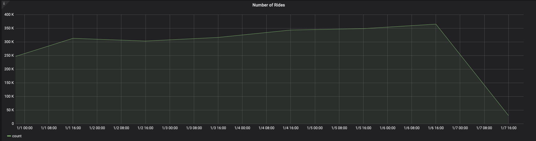
pickup_datetimecolumn as the filtering range for your visualizations:SELECT--1--time_bucket('1 day', pickup_datetime) AS "time",--2--COUNT(*)FROM ridesWHERE $__timeFilter(pickup_datetime)Group your visualizations and order the results by time buckets
In this case, the
GROUP BYandORDER BYstatements referencetime.For example:
SELECT--1--time_bucket('1 day', pickup_datetime) AS time,--2--COUNT(*)FROM ridesWHERE $__timeFilter(pickup_datetime)GROUP BY timeORDER BY timeWhen you visualize this query in Grafana, you see this:
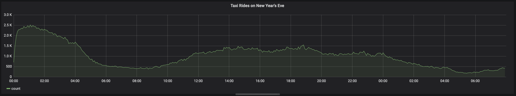
You can adjust the
time_bucketfunction and compare the graphs:SELECT--1--time_bucket('5m', pickup_datetime) AS time,--2--COUNT(*)FROM ridesWHERE $__timeFilter(pickup_datetime)GROUP BY timeORDER BY timeWhen you visualize this query, it looks like this:
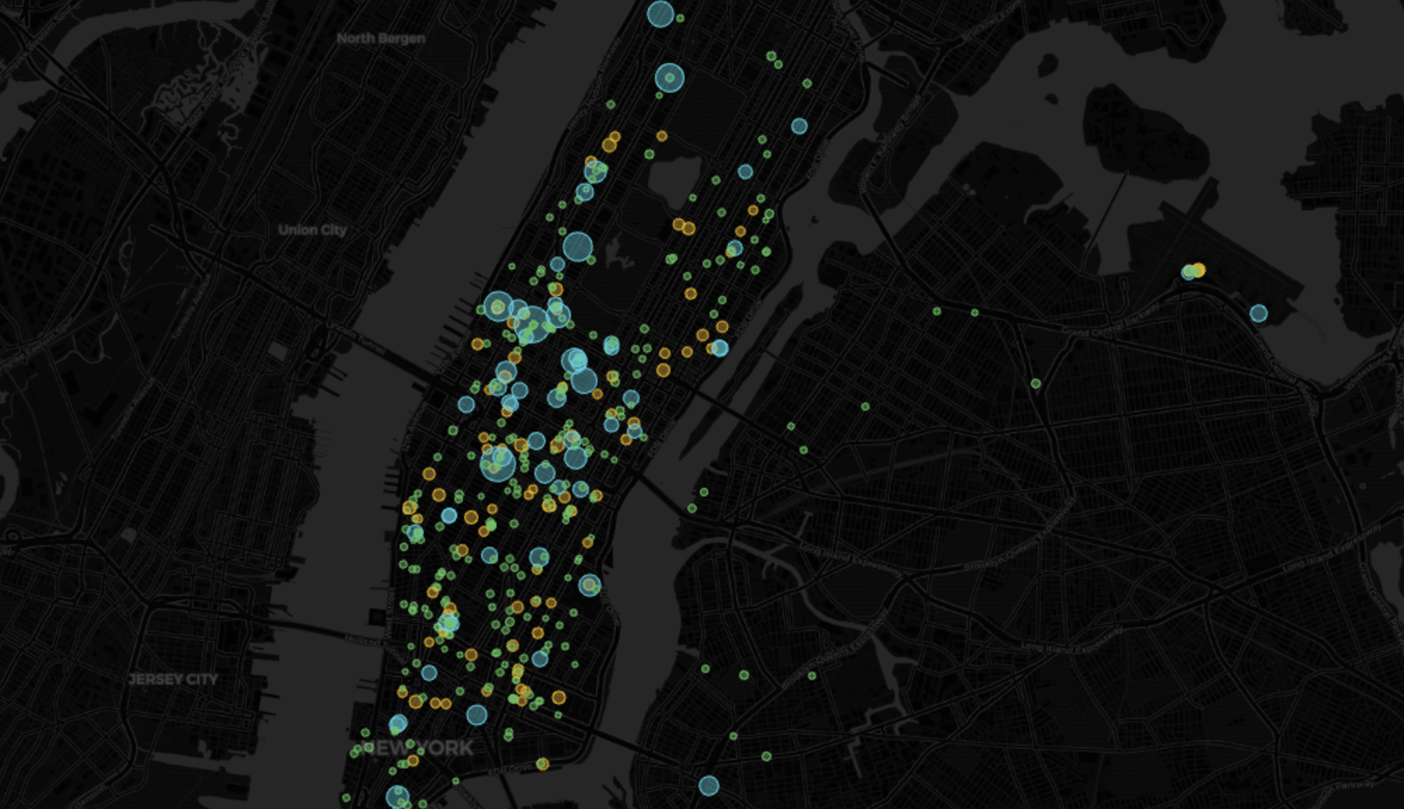
Grafana includes a Geomap panel so you can see geospatial data overlaid on a map. This can be helpful to understand how data changes based on its location.
This section visualizes taxi rides in Manhattan, where the distance traveled was greater than 5 miles. It uses the same query as the NYC Taxi Cab tutorial as a starting point.
Add a geospatial visualization
In your Grafana dashboard, click
Add>Visualization.Select
Geomapin the visualization type drop-down at the top right.
Configure the data format
In the
Queriestab below, select your data source.In the
Formatdrop-down, selectTable.In the mode switcher, toggle
Codeand enter the query, then clickRun.For example:
SELECT time_bucket('5m', rides.pickup_datetime) AS time,rides.trip_distance AS value,rides.pickup_latitude AS latitude,rides.pickup_longitude AS longitudeFROM ridesWHERE rides.trip_distance > 5GROUP BY time,rides.trip_distance,rides.pickup_latitude,rides.pickup_longitudeORDER BY timeLIMIT 500;
Customize the Geomap settings
With default settings, the visualization uses green circles of the fixed size. Configure at least the following for a more representative view:
Map layers>Styles>Size>value.This changes the size of the circle depending on the value, with bigger circles representing bigger values.
Map layers>Styles>Color>value.Thresholds> Addthreshold.Add thresholds for 7 and 10, to mark rides over 7 and 10 miles in different colors, respectively.
You now have a visualization that looks like this:
Keywords
Found an issue on this page?Report an issue![]() or Edit this page
or Edit this page![]() in GitHub.
in GitHub.